Crimes-Before-During-Pandemic
Uses Python to Investigate Whether The Number of Crimes Differs Between Before and During the Pandemic
Project maintained by Stevenh825-git Hosted on GitHub Pages — Theme by mattgraham
Number of Crimes Before/During The Pandemic

Name: Steven Hernandez
Overview
The goal is to investigate whether the number of crimes is different between before and during the pandemic. Additionally, checking how were the amount of crimes distributed amongst different boroughs and groups of people. To clarify, I would like to investigate which boroughs experienced the most hate crimes, how many Asians were affected, and which race the perpetraror of a crime was more often to be. To examine this, the following data was obtained from NYC Open Data:
While investigating this, I conducted a principal component analysis to see the patterns within the data and a logistic regression model to see if the month can predict if a crime is Anti-Asian. Additionally, in order to visualize the findings, many graphs of a few different types were used. In order to utilize bar graphs, line plots, and pie charts, Pandas’ groupby method was used to group and manipulate the data.
Data
Within this dataset, there are 548,836 Rows and 19 Columns. The columns are:
- 'ARREST_KEY'
- 'ARREST_DATE'
- 'PD_CD'
- 'PD_DESC'
- 'KY_CD'
- 'OFNS_DESC'
- 'LAW_CODE'
- 'LAW_CAT_CD'
- 'ARREST_BORO'
- 'ARREST_PRECINCT'
- 'JURISDICTION_CODE'
- 'AGE_GROUP'
- 'PERP_SEX'
- 'PERP_RACE'
- 'X_COORD_CD'
- 'Y_COORD_CD'
- 'Latitude'
- 'Longitude'
- 'Lon_Lat'
The columns used for this project are:
- “ARREST_DATE”: Showcases when the crime occured; this will also help obtain the crimes before the pandemic and crimes that occured during the pandemic before 2021
- “PERP_SEX”: Informs whether the crime was done by a male or female
- “PERP_RACE”: Informs what race was the perpetrator of the crime
- “ARREST_BORO”: Tells what Borough the crime occured
NYPD Arrest Data Year-to-Date:
This dataset contains 115,299 Rows and 19 Columns. The columns include:
- 'ARREST_KEY'
- 'ARREST_DATE'
- 'PD_CD'
- 'PD_DESC'
- 'KY_CD'
- 'OFNS_DESC'
- 'LAW_CODE'
- 'LAW_CAT_CD'
- 'ARREST_BORO'
- 'ARREST_PRECINCT'
- 'JURISDICTION_CODE'
- 'AGE_GROUP'
- 'PERP_SEX'
- 'PERP_RACE'
- 'X_COORD_CD'
- 'Y_COORD_CD'
- 'Latitude'
- 'Longitude'
- 'New Georeferenced Column'
When utilizing this data, the columns used are:
- “ARREST_DATE”: Showcases when the crime occured; where all crimes occurred sometime in 2021
- “PERP_SEX”: Informs whether the crime was done by a male or female
- “PERP_RACE”: Informs what race was the perpetrator of the crime
- “ARREST_BORO”: Tells what Borough the crime occured
This dataset contains 1181 Rows and 14 Columns. The columns include:
- 'Full Complaint ID'
- 'Complaint Year Number'
- 'Month Number'
- 'Record Create Date'
- 'Complaint Precinct Code'
- 'Patrol Borough Name'
- 'County'
- 'Law Code Category Description'
- 'Offense Description'
- 'PD Code Description'
- 'Bias Motive Description'
- 'Offense Category'
- 'Arrest Date'
- 'Arrest Id'
For this investigation, the columns of interest are:
- “Record Create Date”: This will reveal when the crimes occured
- “Patrol Borough Name”: Will help split the data by the borough the crime occured in
- “Month Number”: Knowing the month a crime occured can be used for predicting if the crime is Anti-Asian
- “Offense Category”: Will state what type of Hate Crime the crime falls under
- “Bias Motive Description”: Will state the reason for the Hate Crime
Techniques
The following section will detail each technique used in the project, showcasing the goal of the technique, the code, and the result.
Identifying whether a PCA analysis can be done
The goal is to see whether a 2 dimensional graph is enough to showcase patterns in the data using PCA. Ideally, the graph could be used to higlight the distribution of the type of Hate Crime.
#Represent the categorical data with numbers
df = pd.get_dummies(Hate_Crimes['Offense Category'])

#Center the data
cntr_offense = df - df.mean(axis=0)

#Obtain 's', the one-dimensional array SVD produces
U, s, Vt = svd(cntr_offense, full_matrices=False) #Apply SVD

#Plotting the array squared will showcase the dimensions required to capture variance
plt.plot(s**2);
plt.suptitle('Dimensions Needed to Capture Variance', fontsize=20)
plt.savefig('DimensionsForPCA.png', bbox_inches='tight')
plt.show()
This was the code used to generate the following graph:
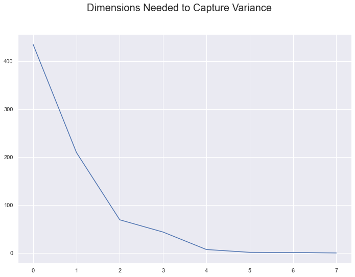
As a result, 2 dimensions is capable of showcasing the data’s patterns. Or more specifically, 2 dimensions can be used to determine the spread of the different types of Hate Crimes.
Performing a Principal Component Analysis on the Data
Now that we now this, we can generate the principal components from performaing matrix multiplication with U and S; where they were both created from the SVD funciton earlier.
#Compute the first two principal components needed for PCA
pcs = U @ np.diag(s)
pc1 = pcs[:, 0]
pc2 = pcs[:, 1]

#Create a dataframe to add the principle components to the original data
case2d = pd.DataFrame({
    'case': df.index,
    'pc1': pcs[:, 0],
    'pc2': pcs[:, 1]
}).merge(Hate_Crimes, left_on='case', right_on=Hate_Crimes.index)

#This function will be used to remove the data from completely overlapping
def jitter_df(df, x_col, y_col):
    x_jittered = df[x_col] + np.random.normal(scale=0.04, size=len(df))
    y_jittered = df[y_col] + np.random.normal(scale=0.06, size=len(df))
    return df.assign(**{x_col: x_jittered, y_col: y_jittered})


sns.scatterplot(data = jitter_df(case2d, 'pc1', 'pc2'),
                x="pc1", y="pc2", hue="Offense Category", alpha=(0.9));

plt.legend(bbox_to_anchor=(1.5, 1), loc='upper right')
plt.suptitle('PCA For Hate Crimes', fontsize=20)
plt.savefig('PCAForHateCrimes.png', bbox_inches='tight')
plt.show()
This code will create:
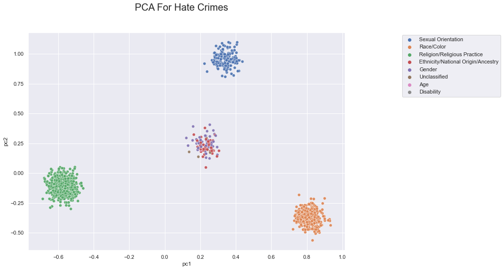
As a result, the data is grouped into 4 clusters. This visualization showcases that there are 3 main groups of Hate Crimes: Sexual Orientation, Religion, and Race. However, it also shows that there are plenty of other Hate Crimes that do not fall within these categories.
Types of Hate Crimes
Now that we see the pattern of the data, it is important to view how many of each type of Hate Crimes from 01-01-2019 to 09-30-2021 there actually are.
Using the following code:
#Can group by Offense Category
#Count how many of each type of hate crime there are

amount_crimes = Hate_Crimes.groupby('Offense Category').agg(
       Number_of_Cases=pd.NamedAgg(column="Full Complaint ID", aggfunc="count"))

hate_crime_graph = sns.barplot(x =amount_crimes.index,y="Number_of_Cases", data=amount_crimes)
hate_crime_graph.set_xticklabels(hate_crime_graph.get_xticklabels(), rotation=45, ha="right")

plt.ylabel("Number of Cases",fontsize=14)
plt.xlabel("Offense Category", fontsize=14)

hate_crime_graph.set_title("Different Types of Hate Crimes(2019-2021)", fontsize=20)
plt.savefig('TypeofHateCrimes.png', bbox_inches='tight')
plt.show()
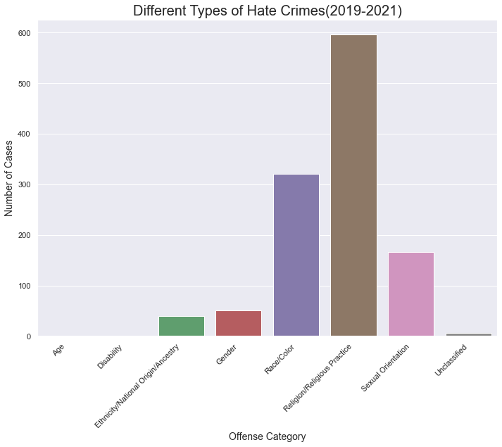
This graph showcases that similarly to the PCA, religion, race, and sexual orientation were the 3 biggest motivators for hate crimes. However, it also shows that there were still plenty of ethnicity and gender motivated crimes.
Different Race Motivated Hate Crimes
While clearly there are different Hate Crimes, it is still unclear whether Asian’s suffered the most crimes. As a result, it is important to see which race was the most targeted from 2019-2021.
#Get the rows exclusive to Race/Color and Ethnicity
race_ethni_crimes = Hate_Crimes.loc[(Hate_Crimes['Offense Category'] == 'Race/Color') | (Hate_Crimes['Offense Category'] == 'Ethnicity/National Origin/Ancestry')]

#Group the data by Bias Motive Descirption, which is the reason for the Hate Crime.
#Also, count how many cases of each group there are.
amount_race = race_ethni_crimes.groupby('Bias Motive Description').agg(
       Number_of_Cases=pd.NamedAgg(column="Full Complaint ID", aggfunc="count"))

race_graph = sns.barplot(x =amount_race.index,y="Number_of_Cases", data=amount_race)
race_graph.set_xticklabels(race_graph.get_xticklabels(), rotation=45, ha="right")
plt.xlabel("Motive", fontsize=18)
plt.ylabel("Number of Cases", fontsize=18)

race_graph.set_title("Different Types of Race Motivated Hate Crimes(2019-2021)",
                     fontsize=20)
plt.savefig('TypeofRaceHateCrimes.png', bbox_inches='tight')
plt.show()
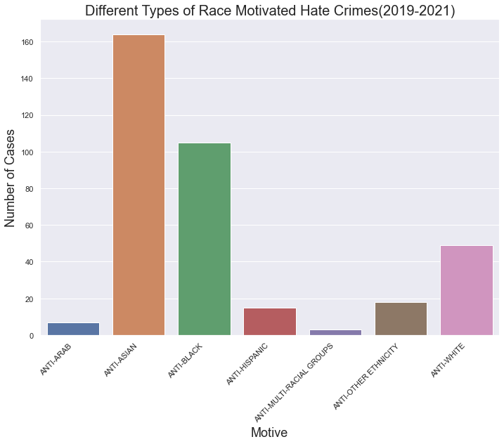
This showcases that from 2019 to 2021, there have been an overwhelming amount of Anti-Asian motivated Hate Crimes.In fact, other than Anti-Black crimes, Anti-Asian Hate Crimes dominate the graph. However, how much of these cases had occured before the pandemic?
Anti-Asian Crimes Before and During the Pandemic
Before we can investigate, the data needs to be cleaned.
#Set the data found in Record Create Date to datetime objects.
race_ethni_crimes['Record Create Date'] = pd.to_datetime(race_ethni_crimes['Record Create Date'])

#Obtain all of the Hate Crimes that were targetting Asians.
anti_asian = race_ethni_crimes.loc[race_ethni_crimes['Bias Motive Description'] == "ANTI-ASIAN"]

#This function will determine whether the dates within a column
#happened before Covid-19 was declared by WHO, or during the Pandemic.
def prepostPandemic(date):

    temp = date['Record Create Date']
    temp2 = []
    start = "03/11/2020"
    start = datetime.strptime(start, "%m/%d/%Y")

    for day in temp:
        if day < start:
            temp2.append("Before")
        else:
            temp2.append("During")
    return temp2

#A new column will hold the information whether a crime occured before or during the pandemic
anti_asian['Before/During Pandemic'] = prepostPandemic(anti_asian)
#Now it is easier to group the crimes by their occurance,
#and count how many of each there are
temp = anti_asian.groupby('Before/During Pandemic').agg(
       Number_of_Cases=pd.NamedAgg(column="Full Complaint ID", aggfunc="count"))


asian_cases = sns.barplot(x =temp.index,y="Number_of_Cases", data=temp)
xes = ["01/15/2019 - 03/10/2020", "03/11/2020 - 09/23/2021"]
asian_cases.set_xticklabels(xes,fontsize=18)

asian_cases.set_title("Amount of Anti-Asian Cases Before & During the Pandemic",
                      fontsize=20)

plt.xlabel("Before/During Pandemic", fontsize=18)
plt.ylabel("Number of Cases", fontsize=18)

plt.savefig('AntiAsian.png', bbox_inches='tight')
plt.show()
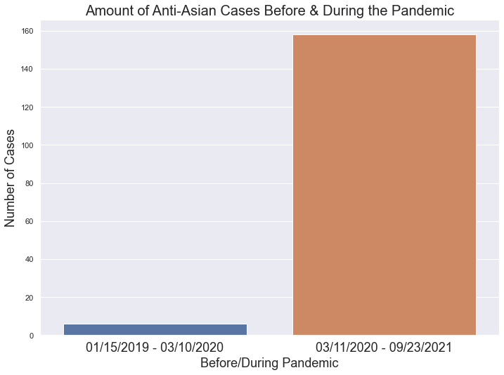
This graph showcases a huge difference between the amount of cases before and during the pandemic. While the amount of months for each category is unequal, there were only about 6 crimes targetting Asians within 14 months versus almost 160 crimes within 18 months. As a result, it is safe to say there has been an increase in stigmatization towards Asians during the Pandemic.
Amout of Hate Crimes Per Borough
It is important to investigate which borough experienced the most crimes. For that reason, the following function is required:
#Function to replace any complicated wording for boroughs
def cleanBorough(borough):

    if borough == 'PATROL BORO BKLYN NORTH':
        return 'Brooklyn'
    elif borough == 'PATROL BORO BKLYN SOUTH':
        return 'Brooklyn'
    elif borough == 'PATROL BORO BRONX':
        return 'Bronx'
    elif borough == 'PATROL BORO MAN NORTH':
        return 'Manhattan'
    elif borough == 'PATROL BORO MAN SOUTH':
        return 'Manhattan'
    elif borough == "PATROL BORO QUEENS NORTH":
        return "Queens"
    elif borough == "PATROL BORO QUEENS SOUTH":
        return "Queens"
    else:
        return 'Staten Island'
Originally in the dataset, Hate Crimes were seperated by the borough they occurred in. However, it also distinguished between North and South sections of Manhattan, Brooklyn, and Queens. To make things easier, I grouped these sections together.
#Clean the data
Hate_Crimes['Patrol Borough Name'] = Hate_Crimes['Patrol Borough Name'].apply(
                                    cleanBorough)

#Group by month and borough, while counting how many cases for each group
month_borough = Hate_Crimes.groupby(['Patrol Borough Name','Month Number']).agg(
       Number_of_Cases=pd.NamedAgg(column="Full Complaint ID", aggfunc="count"))
month_borough = month_borough.reset_index()

#Create the graph
month_boro_graph = sns.lmplot(x="Month Number", y="Number_of_Cases", hue="Patrol Borough Name", data=month_borough, fit_reg=(False))

month_boro_graph.set(ylabel = "Number of Cases")
plt.title("Amount of Hate Crimes per Borough by Month")


#Plot the lines connecting the dots
bronx = month_borough.loc[(month_borough['Patrol Borough Name'] == 'Bronx')]
plt.plot(bronx["Month Number"],bronx["Number_of_Cases"], 'b')

brooklyn = month_borough.loc[(month_borough['Patrol Borough Name'] == 'Brooklyn')]
plt.plot(brooklyn["Month Number"],brooklyn["Number_of_Cases"], 'y')

queens = month_borough.loc[(month_borough['Patrol Borough Name'] == 'Queens')]
plt.plot(queens["Month Number"],queens["Number_of_Cases"], 'r')

manhattan = month_borough.loc[(month_borough['Patrol Borough Name'] == 'Manhattan')]
plt.plot(manhattan["Month Number"],manhattan["Number_of_Cases"], 'g')

staten = month_borough.loc[(month_borough['Patrol Borough Name'] == 'Staten Island')]
plt.plot(staten["Month Number"],staten["Number_of_Cases"], 'm')

plt.savefig('HateCrimesPerBorough.png', bbox_inches='tight')
plt.show()
This would generate an line plot where 5 colorcoded lines are corresponding to one of the 5 boroughs.
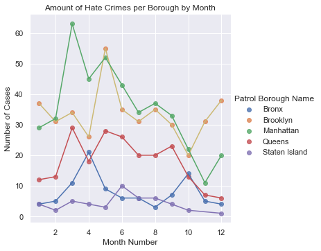
This lmplot showcases that the Hate Crime dataset, which spans from 01-01-2019 to 09-30-2021, contains a lot of data for Brooklyn and Manhattan, whereas the Bronx and Staten Island faced the least hate crimes. However, the decrease in cases for all 5 boroughs during October to December is seemingly the result of the data not yet existing for those months within 2021.
The finding of this data leads to the question: How many of the Hate Crimes within this graph occured before the Pandemic?
#Goal is to group the data by the borough, but also if it occured before or during the pandemic

#Need to set the dates to a datetime object
Hate_Crimes['Record Create Date'] = pd.to_datetime(Hate_Crimes['Record Create Date'])
#Apply the previous function used for Anti-Asian crimes to the entire dataset
Hate_Crimes['Before/During Pandemic'] = prepostPandemic(Hate_Crimes)

#Group by the Borough and whether the crime occurred before or during the pandemic
preduring_borough = Hate_Crimes.groupby(['Patrol Borough Name','Before/During Pandemic']).agg(
       Number_of_Cases=pd.NamedAgg(column="Full Complaint ID", aggfunc="count"))
preduring_borough = preduring_borough.reset_index()

#create the graph
plt.figure(figsize=(8,4))
boroughPrepost = sns.barplot(x ="Patrol Borough Name",y="Number_of_Cases",
                          hue = "Before/During Pandemic", data=preduring_borough)
title = "(01/15/2019 - 03/10/2020) vs (03/11/2020 - 09/30/2021)"

boroughPrepost.set(xlabel = "Borough",ylabel = "Number of Cases")
boroughPrepost.set_title(title)
plt.suptitle("Amount of Hate Crimes Before & During the Pandemic")
plt.savefig('HateCrimesBeforeDuringPandemic.png', bbox_inches='tight')
plt.show()
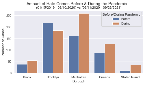
This graph shows how many Hate Crimes each borough experienced. Seemingly, Brooklyn and Manhattan are completely dominating the other boroughs, regardless if the case occured before or during the pandemic.
It is also worth noting that Manhattan experiences way more Hate Crimes during the Pandemic than any other borough.
Logistic Regression Model First Attempt
The goal is to see if a logistic regression could be used to predict whether a Hate Crime’s motive is Anti-Asian using the month in the year.
#First needed to use get_dummies() to be able to use categorical data in the analysis
temp = pd.get_dummies(Hate_Crimes['Bias Motive Description'])

#This column will determine if a Hate Crime is Anti-Asian or not
Hate_Crimes['ANTI-ASIAN'] = temp['ANTI-ASIAN']


#Split the data to have a training set for the model and a testing set

X_train, X_test, y_train, y_test = train_test_split(Hate_Crimes['Month Number'].to_numpy(),Hate_Crimes['ANTI-ASIAN'],test_size=0.4,random_state=42)

#Run the model on the training data

X_train = X_train.reshape(-1, 1)
X_test = X_test.reshape(-1, 1)

clf = LogisticRegression()
clf.fit(X_train, y_train)
Now that the model has been trained, it is important to see how well this model performs through getting its score and setting up a confusion matrix.
#Obtain the score of the model using the testing set
score = clf.score(X_test,y_test)

y_predict = clf.predict(X_test)

#Building the confusion matrix
confuse_mx = metrics.confusion_matrix(y_test,y_predict,labels=[1,0])

#Graph the confusion matrix using a heatmap
bad_logisitic_model =sns.heatmap(confuse_mx, square=True, annot=True, fmt='d',
                                 cbar=True,linewidths=0.2,
                                 xticklabels=['Anti-Asian', "Not Anti-Asian"],
                                 yticklabels=['Anti-Asian', "Not Anti-Asian"],
                                )

plt.xlabel('True Label',fontsize=18)
plt.ylabel("Prediced Label",fontsize=18)
plt.title("Score: 0.87", fontsize=14)
plt.suptitle("Whether a General Hate Crime is Anti-Asian", fontsize=20)

plt.savefig('WhetherCrimeAntiAsian.png', bbox_inches='tight')

plt.show()
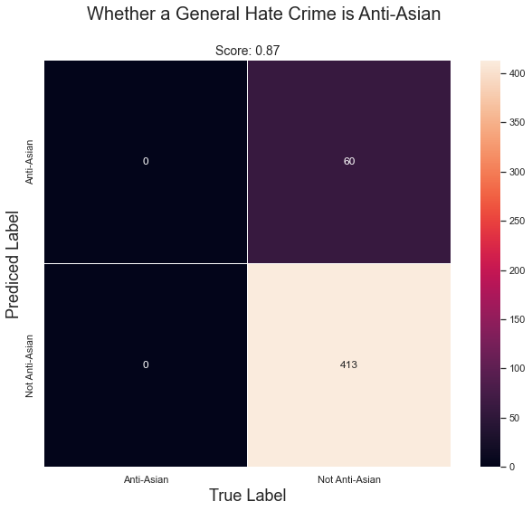
This confusion matrix showcases that while the model does have an impressive score of 0.87, it never predicted whether the crime was Anti-Asian correctly. Therefore, it raises suspision that the only reason it scored so high, was because the majority of cases weren’t Anti-Asian in the dataset. As a result, the model was going to be correct most of the time.
Now it is best to represent the data and the logistic regression model’s predicted probability through a lmplot, where 0 would be when the case isn’t Anti-Asian and 1 it is. There would a line through the graph, showcasing the model’s determined probability of the case being Anti-Asian, depending on the month the case occured.
#Obtain the columns necessary
data = Hate_Crimes[['ANTI-ASIAN']]
data['Month Number'] = Hate_Crimes['Month Number']

#Create a different jitter function to remove overlap for this data
def jitter_df2(df, x_col, y_col):
    x_jittered = df[x_col] + np.random.normal(scale=0, size=len(df))
    y_jittered = df[y_col] + np.random.normal(scale=0.05, size=len(df))
    return df.assign(**{x_col: x_jittered, y_col: y_jittered})

#Create the graph with the columns
bad_lm_pred = sns.lmplot(x='Month Number', y='ANTI-ASIAN',
           data=jitter_df2(data,'Month Number','ANTI-ASIAN'),
           fit_reg=False)

#This will be the X values used to predict
xs = np.linspace(-1, 13, 100)
#Predict the Y's
ys = clf.predict_proba(xs.reshape(-1, 1))[:, 1]

#Plot the line
plt.plot(xs, ys)
plt.title("Hate Crime Data and Predicted Probability")
plt.savefig('HateCrimeLogisticModel1.png', bbox_inches='tight')
plt.show()
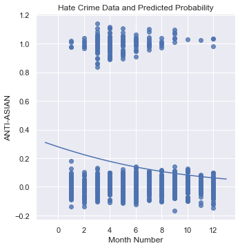
This graph then showcases that no matter the month, the model is going to predict that the case isn’t Anti-Asian. As a result, this shows that the month cannot be an indicator of whether a Hate Crime is Anti-Asian.
Second Attempt at creating a Logistic Model
This time, the goal is to investigate whether a race-related Hate Crime is Anti-Asian. Using similar code, the two following graphs are generated:
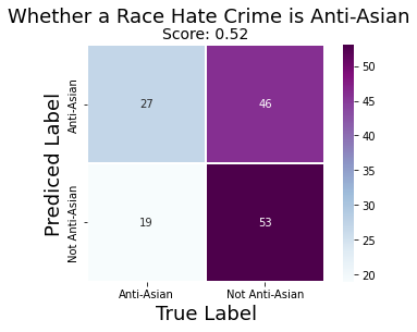
Unlike before, the confusion matrix here is showing that the model is capable of predicting a case is Anti-Asian correctly, by using the month the case occured. However, unlike before, the accuracy of the model has suffered by having a 0.52 score.
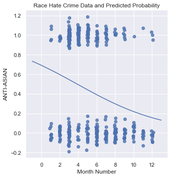
Additionally, the second graph showcases the model is a lot more capable of predicting a case as Anti-Asian. After all, it shows that there is more than a 50% chance a race related hate crime is Anti-Asian if it occurred between January-March. Yet, this entire model can be disregarded because of its poor score.
Therefore, once again, the month a case occurred cannot be used to predict whether a race motivated crime is Anti-Asian.
How were all crimes affected by the Pandemic?
Unlike before, where the data so far was focused on Hate Crimes, this time the data encompasses all types of crimes. The goal now is to see how these cases are distributed amongst different groups of people.
Before investigations begin, it is important to clean the data first. Using the two datasets: NYPD Arrest Data Year-to-Date and NYPD Arrest Data Historic, the code below gets the information ready.
# Fix the last column to match name, they're the same but named differently
ArrestDataHistoric = ArrestDataHistoric.rename(columns={"Lon_Lat": "New Georeferenced Column"})


#Convert the arrest date to datetime
ArrestDataHistoric['ARREST_DATE'] = pd.to_datetime(ArrestDataHistoric['ARREST_DATE'])

ArrestDataCurrent['ARREST_DATE'] = pd.to_datetime(ArrestDataCurrent['ARREST_DATE'])


#Obtain the data from 03/11/2018 - 09/30/2019, when the pandemic wasn't a thing yet.
Arrest_Pre_Pandemic = ArrestDataHistoric.loc[(ArrestDataHistoric['ARREST_DATE'] >= "03/11/2018")
                                     & (ArrestDataHistoric['ARREST_DATE'] <= '09/30/2019')]


#Grab the dates from start of the pandemic (2020) within Historic
#ArrestDataCurrent doesn't contain the dates of the pandemic within 2020
#Dates added will be from 03/11/2020 - 12/31/2020

start_of_pandemic = "03/11/2020"

Arrest_Pandemic_Start = ArrestDataHistoric.loc[(ArrestDataHistoric['ARREST_DATE'] >= start_of_pandemic)]

# so take the 2020 year arrest data and add those rows to the current arrest data
Pandemic_Arrests  = ArrestDataCurrent.append(Arrest_Pandemic_Start)

#Pandemic_Arrests['Year'] = Pandemic_Arrests['ARREST_DATE'].dt.year
Now there are two dataframes, where one hold all the arrests between 03/11/2018 - 09/30/2019, and the other holding cases from 03/11/2020 - 09/30/2020
Differences Amongst Gender
After obtaining data showcasing the amount of cases per borough(seperated by gender for both before the pandemic and during), the goal is to showcase the data in 4 seperate columns on a bar graph.
#Obtain the columns containing the amount of cases per borough where the perpretrator was male or female
boroughGender = boroughPrePandemic[['Perp_Female', 'Perp_Male']]
#Rename the columns to showcase it is data from before the pandemic
boroughGender = boroughGender.rename(columns={"Perp_Female": "Female (Pre-Pandemic)",
                                              "Perp_Male": "Male (Pre-Pandemic)" })

#Obtain the data for during the pandemic
boroughGender['Female (Pandemic)'] = boroughPandemic['Perp_Female']
boroughGender['Male (Pandemic)'] = boroughPandemic['Perp_Male']

#Sneaky way to get all the columns, but no rows
genSum = boroughGender[0:0]
genSum=genSum.reset_index(drop=True)

#Obtain the sum of each column
colsum = boroughGender.sum(axis=0)

#Add the sums as a row in genSum
genSum =genSum.append(colsum, ignore_index= True)

borogen_plt = sns.barplot(data=genSum,
                          order=["Female (Pre-Pandemic)", "Female (Pandemic)",
                                 'Male (Pre-Pandemic)', 'Male (Pandemic)'])
plt.suptitle('Crimes Committed Before vs. During Pandemic',fontsize=20)
plt.title("Seperated by Gender",fontsize=18)
plt.ylabel('Number of Cases', fontsize=15)
borogen_plt.set_xticklabels(borogen_plt.get_xticklabels(),
                            rotation=30, ha="right")

plt.savefig('GenderBeforeDuring.png', bbox_inches='tight')
plt.show()
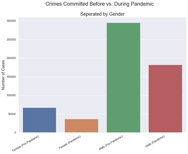
As a result, the data showcases that there was a decrease in the amount of crimes overall for both genders during the pandemic. This could be because the Pandemic caused less people to travel outdoors, thus less accidents. Meanwhile, males clearly performed more crimes than females overall.
Gender, Borough, and Number of Crimes
It is important to visualize how the amount of crimes differed between before and during the pandemic. For that reason, the data is going to be grouped in two ways: By borough and Gender. This way, it will further showcase the differences between Sex while highlighting the differences between the boroughs.
Firstly, the code below will showcase how the data before the pandemic looks.
#Group the data
preboro = Arrest_Pre_Pandemic.groupby(["ARREST_BORO","PERP_SEX"]).count()
preboro = preboro.reset_index()

#Plot the data with a barplot
#y is ARREST_KEY since the groupby contained count(), thus highlighting how many cases there were in each group

borogen_plt = sns.barplot(x="ARREST_BORO", y ="ARREST_KEY", hue = "PERP_SEX",data=preboro,
                          palette=['indianred','goldenrod'])

plt.suptitle('Crimes Pre-Pandemic (03/11/2018 - 09/30/2019)', fontsize=20)

plt.xlabel('Borough', fontsize=17)
plt.ylabel('Number of Cases', fontsize=15)

borogen_plt.set_xticklabels(["Bronx", "Brooklyn", "Manhattan","Queens","Staten Island"])
legend = borogen_plt.get_legend()
legend.set_title("Perpetrator Sex")
plt.savefig('CrimesPrePandemic.png', bbox_inches='tight')
plt.show()
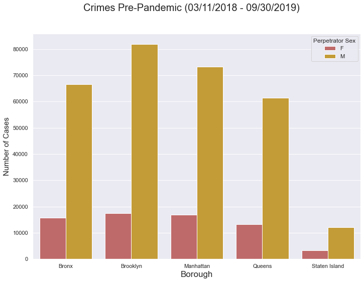
This graph reveals that in each borough, males perform a lot more crimes. Furthermore, Brooklyn faced the most crimes, while Staten Isalnd faced the least. It is worth noting that women never exceeded 20000 crimes, while in Brooklyn males performed over 80000.
Now the code will show how this changed during the Pandemic.
#Group the data
during_boro = Pandemic_Arrests.groupby(["ARREST_BORO","PERP_SEX"]).count()
during_boro = during_boro.reset_index()

#Create the Graph
borogen_plt = sns.barplot(x="ARREST_BORO", y ="ARREST_KEY", hue = "PERP_SEX",data=during_boro,
                          palette=['Red','darkslategrey'])

#Edit the graph
plt.suptitle('Crimes During Pandemic (03/11/2020 - 09/30/2021)', fontsize=20)

plt.xlabel('Borough', fontsize=17)
plt.ylabel('Number of Cases', fontsize=15)

borogen_plt.set_xticklabels(["Bronx", "Brooklyn", "Manhattan","Queens","Staten Island"])
legend = borogen_plt.get_legend()
legend.set_title("Perpetrator Sex")
plt.savefig('CrimesDuringPandemic.png', bbox_inches='tight')
plt.show()
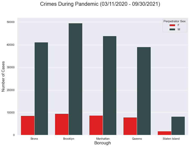
Interestingly, at first glance the pattern of the graph looks near identical to the previous. Like before, Brooklyn contains the most cases, while Staten Island faced the least. However, it is worth paying attention to the scale. The scale showcases the crimes within each borough decreased significantly.
To highlight the differences, the code below will overlap the two graphs. The goal was to plot both graphs onto the same figure.
#This is near identical to the first graph's code:

preboro = Arrest_Pre_Pandemic.groupby(["ARREST_BORO","PERP_SEX"]).count()
preboro = preboro.reset_index()
borogen_plt = sns.barplot(x="ARREST_BORO", y ="ARREST_KEY", hue = "PERP_SEX",data=preboro,
                          palette=['indianred','goldenrod'])

plt.suptitle('Crimes Pre-Pandemic (03/11/2018 - 09/30/2019)', fontsize=20)

plt.xlabel('Borough', fontsize=17)
plt.ylabel('Number of Cases', fontsize=15)

borogen_plt.set_xticklabels(["Bronx", "Brooklyn", "Manhattan","Queens","Staten Island"])


#This is near identical to the second graph's code:

during_boro = Pandemic_Arrests.groupby(["ARREST_BORO","PERP_SEX"]).count()
during_boro = during_boro.reset_index()
borogen_plt = sns.barplot(x="ARREST_BORO", y ="ARREST_KEY", hue = "PERP_SEX",data=during_boro,
                          palette=['Red','darkslategrey'])

plt.suptitle('Crimes Pre/During Pandemic (03/11/2018 - 09/30/2021)', fontsize=20)

plt.xlabel('Borough', fontsize=17)
plt.ylabel('Number of Cases', fontsize=15)

borogen_plt.set_xticklabels(["Bronx", "Brooklyn", "Manhattan","Queens","Staten Island"])

#Needed to alter the legend to make sure it is labeled correctly for each bar

plt.legend(title='Perpetrator Sex', loc='upper right', labels=['F Pre-Pandemic', 'M Pre-Pandemic',
                                                               'F Pandemic', 'M Pandemic'],
           bbox_to_anchor= (1.25, 1) )

#Set the colors of the legend so it matches with the colors of the bars
legend = borogen_plt.get_legend()
legend.legendHandles[0].set_color('indianred')
legend.legendHandles[1].set_color('goldenrod')
legend.legendHandles[2].set_color('red')
legend.legendHandles[3].set_color('darkslategrey')

plt.savefig('CrimesPreDuringPandemic.png', bbox_inches='tight')
plt.show()
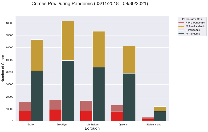
This graph then clarifies the huge differences in the amount of crimes before and during the pandemic. While the pattern is similar, the crimes faced during the Pandemic is cut almost half it was before.
Highlighting How Many Crimes Were Committed By A Member of Each Race
Before The Pandemic
The goal is to create a Pie Chart showcasing the percentage of crimes committed by perpetrators of different races. Thus the following code will obtain the necessary data, and plot it onto a Pie Chart.
#Make the columns AMERICAN_INDIAN_ALASKAN_NATIVE, ASIAN_OR_PACIFIC_ISLANDER,
#   BLACK, BLACK_HISPANIC, , WHITE, WHITE_HISPANIC  appear on the index
empty = boroughPrePandemic.T

#Remove unnecessary columns, so only the columns about the boroughs remain
empty = empty[3:]
#Take the sum of each row, so the total cases per race is identified
sumcol =empty.sum(axis=1)

#Make a new column for the sum
empty['Total'] = sumcol

#Obtain the percentage by using the total cases per race divided by total cases
empty['Percentage'] = (empty['Total'] /sum(empty['Total'])) *100

#Create a variable holding the labels for the Pie Chart
categories = ["American Indian / Alaskan Native","Asian/Pacific Islander", "Black",
         "Black Hispanic", "White", "White Hispanic"]

#Create Pie Chart
plt.pie(empty['Total'] ,labels=categories,autopct='%1.1f%%',
        explode = (0.2,0.1,0,0,0,0),shadow=True,startangle=160)

plt.title("Percentage of Crimes Committed by Race Before Pandemic",fontsize=20)
plt.savefig('Pie1.png', bbox_inches='tight')

plt.show()
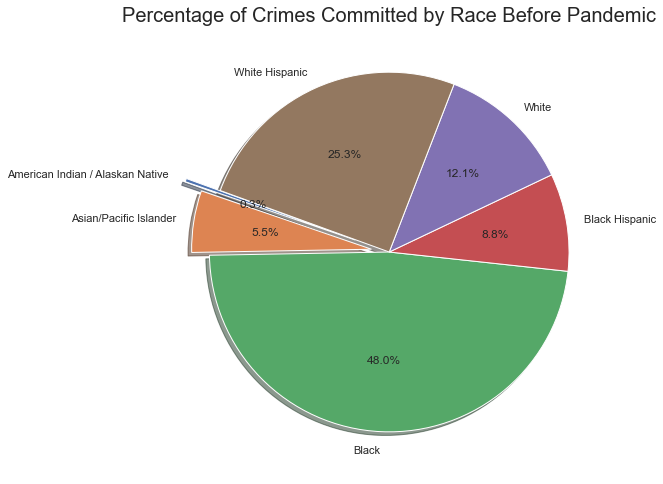
These categories are how the dataset categorized the race of the perpetrator races, thus left unaltered. Looking at the graph, it shows plenty of the perpetartors were Black, while more White Hispanics were the perpetrator than Black Hispanics. However, did the percentages change during the Pandemic?
During The Pandemic
Similarly, the goal is to create a Pie Chart, but with data of the crimes during the Pandemic.
#Make the columns AMERICAN_INDIAN_ALASKAN_NATIVE, ASIAN_OR_PACIFIC_ISLANDER,
#   BLACK, BLACK_HISPANIC, , WHITE, WHITE_HISPANIC  appear on the index
empty = boroughPandemic.T

#Remove unnecessary columns, so only the columns about the boroughs remain

empty = empty[3:]

#Take the sum of each row, so the total cases per race is identified

sumcol =empty.sum(axis=1)
empty['Total'] = sumcol


#Obtain the percentage by using the total cases per race divided by total cases

empty['Percentage'] = (empty['Total'] /sum(empty['Total'])) *100

#Create a variable holding the labels for the Pie Chart

categories = ["American Indian / Alaskan Native","Asian/Pacific Islander", "Black",
         "Black Hispanic", "White", "White Hispanic"]

#Create Pie Chart

plt.pie(empty['Total'] ,labels=categories,autopct='%1.1f%%',
        explode = (0.2,0.1,0,0,0,0),shadow=True,startangle=160)

plt.title("Percentage of Crimes Committed by Race During Pandemic",fontsize=20)
plt.savefig('Pie2.png', bbox_inches='tight')

plt.show()
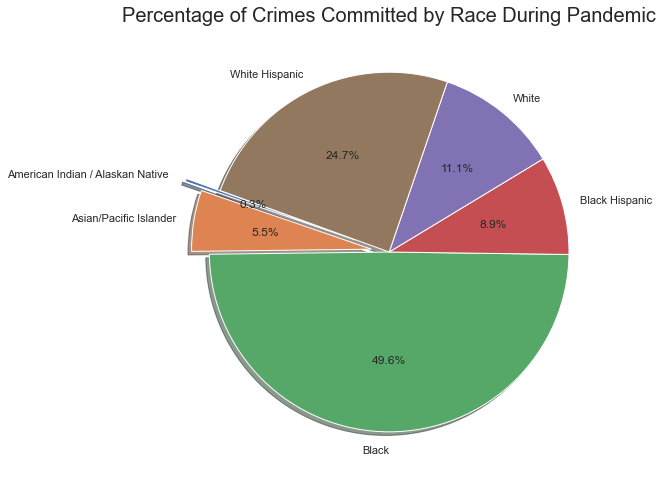
Interestingly, the percentage of the crimes is near identical. This showcases that while there were less crimes during the Pandemic, the distribution of the perpetrator’s race was almost unaltered. It is worthy to note, this result is similar to how crimes were distributed amongst the boroughs.
Conclusions
-
There are 3 main groups of Hate Crimes: Sexual Orientation, Religion, and Race.
- Still plenty of ethnicity and gender motivated crimes.
-
There was an increase in stigmatization towards Asians during the Pandemic.
- An overwhelming amount of Anti-Asian motivated Hate Crimes from 2019 to 2021.
-
Brooklyn & Manhattan experience the most hate crimes.
-
The month alone can’t indicate the likelihood of a crime being Anti-Asian
- There was a decrease in all types of crimes:
- Males performed more crimes
- Possibly due to quarantine
- The distribution of crimes amongst races and gender is similar between the two time periods.
LIMITATIONS:
- The number of months making up the two time periods is unequal.
- The pandemic had more months of data
- Data is nissing for later parts of 2021, thus underestimating the amount of cases.
Due to limitations, further analysis may be required.